-
Analyze Run View
Great runs are often determined by the peak months of our training. To keep improving, we need to understand what worked and what didn’t. That’s why we built the Analyze Run View. By looking at the training in the months leading up to a race, we can indentify what made certain PR’s possible.
You can view the training that took place 3 months prior to any best performing run by clicking on that run within Pace Trends or PR Progress. At a glance, you’ll see your performance, the basic conditions that affected that performance, and the details about your training that led up to that run.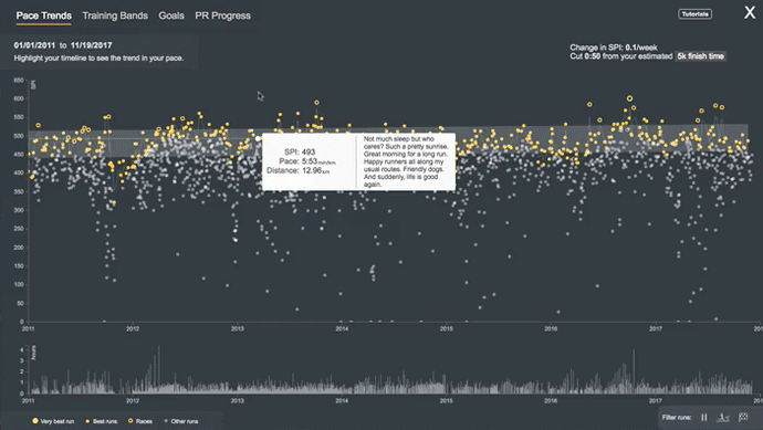
All the runs that you did in the 90-day period leading up to that run you’re viewing show up as a distribution. This allows you to easily visualize how many of those runs were longer/shorter, faster/slower, or had a higher-lower heart rate. So, you might find that 75% of all your runs leading up to your 5km PR were under 7km long, that 10% of all your training runs were within 10 seconds of your 5k PR pace, and that you averaged 40km/wk in the 90 days leading up to race day. The Analyze Run View is a great way to learn from your best runs!
-
Pace Trends
Speed improvement is one of those things that's easy to misjudge when you're not looking at the right metrics. Taking an average of the paces of all your runs for a given month is often an inaccurate representation of what you can actually do, especially if you have a wide variety of training runs throughout the month. Ideally, you'd want to weigh each run differently depending on the length of the run, because shouldn't your 10km tempo count more than your 5km recovery? Even that gets complicated.
Since the SPI value normalizes pace across different distances, it's able to compare every distance as equals. That makes it an invaluable tool for measuring overall improvement. It helps you realize that a 7:00min/mi (4:20min/km) may not actually be as good as your 4-hour marathon and that should make sense because you might be able to run a super fast mile, but can you keep up that same pace over the distance of a marathon?
Pace Trends takes your 3 best performing runs every month and draws a best fit line through them, across your entire running history, so you can see how well you've improved your overall pace over time. The chart also calculates your average weekly SPI change and how it affects your 5k time.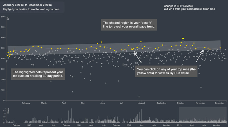
The great thing about Pace Trends is that you can isolate your training cycles and see your gains for a given period. It's common for runners to fall in and out of a training schedule or even take planned breaks so it's nice that you can look at your run data from when you resumed training onwards.
-
Pace Variability
Every runner knows that there's more to running that just running fast. There's even plenty of both logical and empirical evidence suggesting that a pacing strategy delivers better performance.
If you start out too strong in a long distance event, you could burn out too quickly. Start out too slow for a 5k race and you might finish short of your goal time. The distance often matters just as much as the speed, and successfully running any distance at goal pace requires a little bit of practice.
To develop an inherent sense of pace, you have to learn it by feel and the more time you spend running, the quicker you'll learn how to pace yourself. Although, it also helps to have an idea of how much your pace varies for any given run. That's why we introduced the Pace Variability metric.
Pace Variability gives you a slightly different visual representation of your change in pace over route chart - basically, in the form of a circle. Think of it as a quick glance view of how you paced yourself for a particular run.
It is calculated by looking at the distance traveled in 10 second intervals over the course of your run and finding the average deviation.
For example, the chart below on the left is a pretty stable run at only 4% pace variability, whereas the chart on the right is much more like a fartlek and the pacing changes a lot.Sometimes, you want to be able to delineate the changes in your speed (like in intervals). Other times, you might want to keep it a little steadier (like in tempo runs). The amount of attention you give to pace variability really depends on the context of your run but, whenever you need to work on fine-tuning your sense of pacing, it'll be on your By Run page to help you.
-
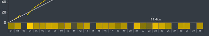
Progress Towards Goal
The purpose of Progress Towards Goal is to help you stay on track with your training. Whether you miss a training day, reschedule a long run, add a rest day, or switch to a down week, Progress Towards Goal will tell you how much you need to run in order to catch up.
The grey line represents the most direct path to your goal. The slope is determined by your goal distance divided by the number of days in that time period. If your goal distance was 300km and you have 30 days to complete it, then the slope is 10km/day. Of course, not everyone runs every day. So think of the grey line as your guidepost. The closer you are to it, the more likely you'll stay on track to reaching your goal.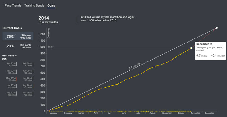
The yellow line is your current progress. Being above the grey line means you're ahead.
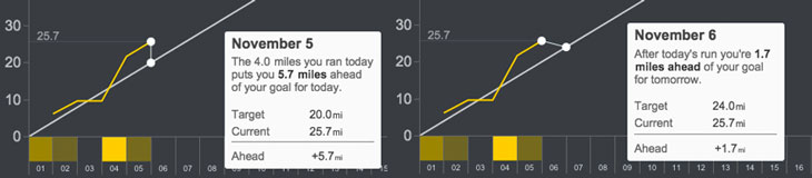
If you mouse over your historical progress, you'll see where you were in terms of distance at that point in time. If you mouse over future dates, Progress Towards Goal calculates the average distance you need to cover in order to reach your goal.
If you're far behind, you'll see that the line connecting your current progress to your most direct path turns into a red line. The brighter the shade of red, the more aggressive the path to reaching your goal. The lighter the shade of red, the more conservative the path is towards your goal. This is determined based on the proportion of distance you have to cover each day over the number of days you have left.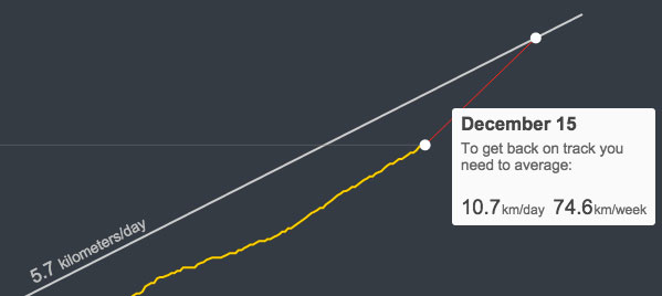
The x-axis shows you the days when you ran. If you mouse over any one of them, it'll indicate the total distance you covered for that day. If you ran twice in one day, it will show the total distance for those two runs. Clicking on it will take you to the corresponding By Run page.
The main thing to keep in mind about Progress Towards Goal is that it helps you reach your goals by giving you as many options as possible to stay on track. So you can be ahead, behind, or on target. It will always tell you what you need to know.
-
Pro Map
The Pro Map is the most comprehensive view you can have of any given run. It's easy to navigate and it provides insight on the relationships and interdependencies between your pace, HR, hill grade, and cadence.
By default the route, itself, is a visual representation of your speed but, with much more granularity than what you might find from a traditional heat map. It doesn't just indicate fast and slow but, actually shows you a more precise pace distribution.
For example, this is what a map might look like for a 5k race. The range of paces that you see on this map goes from 8:45min/mi (5:26min/km) to a 5:31min/mi (3:25min/km).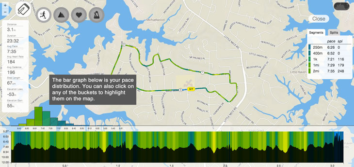
Here's a map of a very hilly run that includes a bunch of walks and recovery.
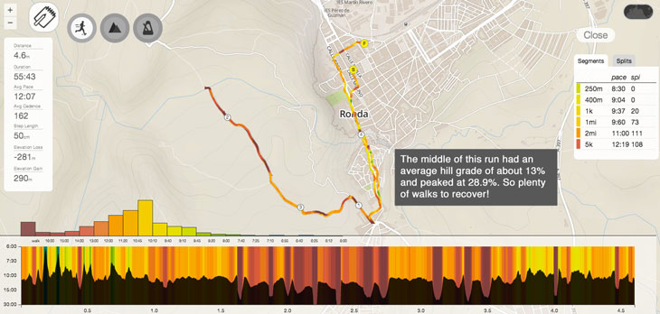
The great thing about this level of detail is that it makes it possible for you to look at your old runs and be able to tell the kind of run you did based on the colours alone. And, because, the pace buckets are absolute (e.g. super fast is always colour white and a walk is a very dark red), you can actually see how much you've improved relative to your past performance.
Here are a few other things you can do with the Pro Map.
View the Summary Details of Specific Segments
Like any other map, the Pro Map also has a legend. The legend is useful for viewing the details associated with selected pace buckets, HR zones, hill grades, and cadence ranges.
For example, if you click on any of your pace buckets for a particular run, you'll notice that the legend will display the distance, duration, and average pace for parts of your run that only reflect that pace range. If you run with a cadence sensor and/or a HR monitor, you'll also see summary data for those two metrics.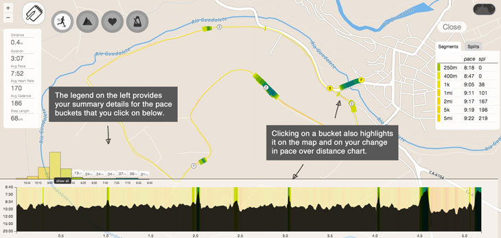
Highlight Values Quickly and Easily
As noted above, the distribution bar graph at the bottom of the map helps you drill down into the filter you've chosen. If you're looking at pace, you'll see a bar graph of your pace distribution. If you're viewing HR, you'll see the different HR zones, etc.
Here's how you select specific distributions: click a bar graph once to highlight only that segment, twice to include everything above it, three times to include everything below it, and a fourth time to reset.
View the Relationships Between Different Variables
Let's say you're currently viewing your pace distribution on your route map. If you mouse over the hill grade filter, you'll see an outline of your run's hills on the change in pace graph at the bottom including a secondary y-axis to show you the scale.
If you run with a HR monitor or a cadence sensor, you can also mouse over those filters while viewing your pace distribution to see how your speed changes at different heart rates and turnover rates.
Select Fastest Segments
Every run will have its fastest segments and the number of segments calculated depends on the length of the run. If you click on a segment, it will be the only part of your run highlighted on the map so you can see exactly where it took place. Each segment will also have its corresponding pace and a Smashrun Performance Index (SPI) value associated with it.
View Splits for Pace, Elevation, HR, and Cadence
Splits will always show up on the right side of the map, in the same section as Fastest Segments. To isolate the split within your route map, just click on it and the legend, the distribution graph, and the change in pace over the distance graph will all change to reflect what you selected.
You can also switch between filters (pace, HR, hill grade, cadence) in order to see their corresponding splits.
For a much quicker summary on the Smashrun Pro Map, watch this short 1min 44sec video. It pretty much tells you everything you need to know about the map. Happy analyzing!
From Smashrun's blog: 3 Tips for Using Smashrun's Pro Map
-
PR Progress
PR Progress is a visual representation of your personal records over time. You can compare your recent PR’s against your all time records, and maybe even identify your next personal best based on any PR.
For most beginner runners, it’s easy to notice performance gains in a short amount of time. For long-term runners, especially those who race several times a year, performance gains are not always as easy to measure. Just because you missed a target time for a given race, doesn't necessarily mean that you didn't set a new PR. And, more importantly, your recent best performing run could actually lead to a PR in other distances.
The default view for PR Progress draws a line through your all time best performing runs. The scatter plot underneath are all of your other runs. The line, effectively, represents the boundary between the best you've ever done, and what's left to achieve.
Analyze Past Performance
You can visualize how your PR's have changed over time by highlighting a section of the timeline and dragging it forward (or back). As you select a period, Smashrun plots your PR's within that time frame so that you can compare it to your all time bests.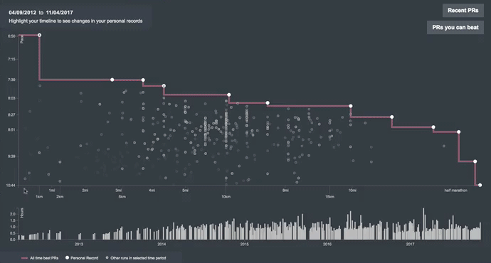
This helps you see:
- how long it's been since you've run a certain distance,
- how long it's been since you've set a PR for any distance,
- and when you might have had down periods in your training.
Predict Future Performance
You can also see which of your current PR's you might be able to beat based on a PR you've set in the past 30/60/90 days Just click on 'PR's you can beat', select a period, and click next. This generates a predictive curve where each yellow dot indicates your predicted performance for the distance based on your reference run.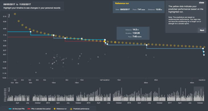
Mouse over any of the predictions to see what they are. Click next to differentiate the predictions between those that are better than your all time PR's from those that are not. Click next once more to map the remaining predictions to common race distances. Mousing over any of these predictions shows your predicted time, pace, and percentage improvement over your current time for that distance.
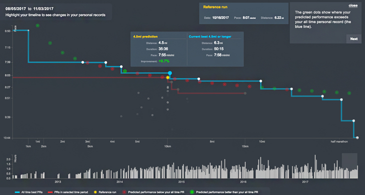
It's important to note that the predictions are only as good as your reference run. Differences in elevation change, temperature, or even the curviness of the route can throw off the projection. And, in general, longer distances make better reference runs than shorter distances.
-
Smashrun Performance Index (SPI)
As distance increases, pace decreases along a predictable curve. That means, regardless of how fast a runner you might be, you'll have to slow down at some point as you start running much longer distances. The Smashrun Performance Index (or SPI) normalizes that predictable curve so that you can compare runs of different distances as equals.
SPI uses a scale of 1 - 1,000 where a value of 1 is an estimate of the fitness required to walk for 5km at moderate pace and a value of 1,000 is a world-record breaking time for the distance you ran. Note that depending on the total distance of a particular run, it can sometimes be difficult to calculate a valid SPI for very short segments, so it's not unlikely to find a single 250-meter or 400-meter run that have no SPI value.
Currently, you can view your SPI within individual run details, the route map, and Pace Trends.
From Smashrun's blog: How to use SPI (and Pace Trends)
-
Training Bands
A training band is the sum of all the time you've ever spent running at a specific pace, HR zone, or hill grade. If you combine all of your training bands for any given category, you'll get a distribution curve, which tells a story about your training.
Smashrun's Training Bands takes each trackpoint recorded by a GPS device to create an aggregate graph of every second of every run across someone's entire running history and organizes the data by pace, HR, and hill grade.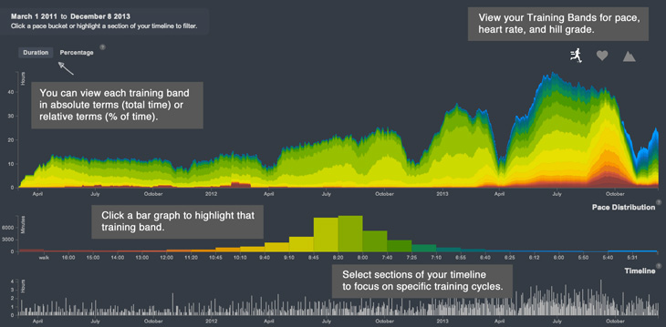
Looking at absolute and relative time spent at different training bands makes it easier for runners to manage long-term progression. In addition, here are some examples of what you might look at within your training bands:
Pace Distribution- Filter by tempo pace and above to see if you're doing more speedwork than easier runs and recovery.
- Filter by VO2max pace to see if you're consistently incorporating interval workouts every couple of weeks.
- View the percentage pace distribution of all runs for the past year to identify seasonal patterns in your pacing.
Heart Rate Distribution
- Filter by Anaerobic Zone to see how often you push your lactate threshold during your training cycle.
- Filter by Aerobic Zone to see if you're contributing enough time to building a solid base.
- Filter by Recovery to see if you're resting enough when you're training hard.
Hill Grade Distribution
- View the percentage distribution of all runs for all hill grades to see when you incorporated hills into your training.
- Filter by >1% grade to see the amount of your training done on hills.
- Filter by various hill grades to isolate training periods with difficult hills.
The thing to keep in mind is that the more you run, the more insight you can derive from your training bands. Use it to keep yourself on target with your training goals or to prevent overtraining and spot injury risks. Training Bands is a powerful tool for performing cross run analysis and we built it to help runners train for the long haul.
From Smashrun's blog: Training Bands and Training Volume